Sunday, November 20, 2011

Response 3


For this last reading I chose to talk about Messa di Voce. It caught my eye when we saw a bit of it in class. The interactivity is two-fold and complex. The first takes vocalizations from a person and transfers that into a graphic form. Once the graphic form is displayed, the vocalization used to make that graphic is saved. This leads to the second bit of the interactivity. The graphics can then be selected and manipulated to replay the sound that created it. This can lead to some very interesting performance art.

Messa di Voce uses software that integrates speech analysis and real-time video camera tracking. Things recorded are then projected on screens behind the performers. Tracking allows for the visualization to appear to be coming from the heads of the performers.

The previously mentioned technology, in the form of the software that allows for the interactivity, is used almost solely to enhance the performance and help visualize the possible meanings. As I have stated before, I believe meaning in art is subjective and based on the reactions of the observer. An artist can help try and “push” the observer in a direction using a variety of stimuli.

Messa di Voce lies at an intersection of human and technological performance extremes, melding the unpredictable spontaneity and extended vocal techniques of two master composer-improvisers with the latest in computer vision and speech analysis technologies. Utterly wordless, yet profoundly verbal, Messa di Voce is designed to provoke questions about the meaning and effects of speech sounds, speech acts, and the immersive environment of language.

Above is the purpose of Messa di Voce. I feel it is hard to describe the artist’s voice in this which is ironic since the piece is all about placing voice and making it visible for all the world to see. Especially within this piece, the voice can belong to a couple different groups. While Golan Levin and Zach Lieberman helped to make the software and allowed for a certain number of possibilities based on what they wanted to happen, Jaap Blonk, Joan La Barbara and any other vocalist that may perform have their own vision and voice for a performance.

Response 2


Within the argument about Listening Post and if it is truly interactive art, there is almost a tone of “If a tree falls”… Listening Post ran if the observer is there or not. Huhtamo argues against Listening Post on the basis that that interaction with the work is mental and has nothing to do with the body of the observer and physical interaction. Huhtamo also dislikes the idea of “system interaction” because it could possibly redefine previously made art that was not considered interactive before Listening Post won the Golden Nica and the jury making the decision and expanding the framework. “If the word interactive is to retain anything about its former distinctiveness, it should, perhaps, be after all reserved to cases where active and repeated user-intervention plays a significant role in the functioning of the system.” When bringing up Ken Rinaldo’s Augmented Fish Reality, Huhtamo seems to want to insist that in the realm of Interactive Art, only humans can be users and participants. Towards the end of the article there is also a suggestion of what category  Listening Post should have one and accused the jury for that category of not having the “correct” agenda. Huhtamo also suggests making a whole new category just for art pieces like this.

I side more with the Interactive Art jury and its framework. I believe there is an interactive aspect in all art that may be more passive at times.  Looking at the 2006 winner Paul DeMarinis and his piece The Messenger, I see a work much like that of the Listening Post. It can be running with or without a human observer and that can be argued against being interactive art or even art in general. I still feel there is an aspect of art in it even if it is running unobserved. Ashok Sukumaran’s Park View Hotel has a more interactive aspect like what Huhtamo seems to require in a Golden Nica Interactive Art winner. Sure people make the lights move by pushing buttons but is it less than art to the passive observers? They are seeing this unfold before them and reacting to it even though they are not “touching” the work itself. To me, interactive art is still art. Art is called that by the observers, even if it can or cannot be touched. The validity of the piece can also be argued by the observer. Debate is good but definitions and frameworks, just like beliefs, are highly subjects and should be given a lot of freedom and wiggle room.

Tuesday, October 4, 2011

ART 399 Response Assignment 1


After reading 'Delusions of Dialogue: Control and Choice in Interactive Art' by Jim Campbell I identified 3 main arguments. The first being that a truly interactive experience with a piece of interactive art is impossible with the current level of technology. Next is the idea that it is near impossible to change an emotion into a mathematical equation that computers use in programming. Lastly the idea that something is lost in the transformation data and much art today has come out with the "Photoshop Effect". The piece I chose to analyze is Bondage by Atau Tanaka. With the above frame work it is easy to say that this is not an interactive piece. Atau Tanaka admits as much. The viewers presence activates a loop and silhouettes of the viewer uncover bits of the image but in Tanaka's own words;


"The result is a total environment, a concentrated space where sound meets image, but where interaction is not pushed to the fore. Instead, I attempt to create a magical space, drawing upon the voyeuristic fantasies of the viewer as he tries to access the untouchable woman on the other side of the screen."


Trying to apply the first argument to this piece seems inappropriate. It was never meant to have real viewer participation. I feel that changing an emotion into a mathematical equation shouldn't be an issue for this or any other piece. As an artist you may be trying to evoke a certain emotion through your art but there are no guarantee that the viewer will get that same emotion out of it. The best you can do is use the tools you have and make something you are proud of. I feel Tanaka got his point across with Bondage without have to try to turn feelings into math.


Lastly is the "Photoshop Effect" and loss in transformation. Tanaka is using a third party tool in this piece. Campbell states "... it is usually the third-party software that become the soul of the work -- the "Photoshop Effect" in which the software that  is used was written to create the same effect or responses over and over again. Such software becomes not a tool  but a palette of cliche symbols". Again I don't feel that this is ever the case. I see no loss and no cliched symbols in this:


All software, like the computers themselves, are tools. It is up to the user to know how do use it and use it well.


In my personal opinion I feel that Campbell is mainly upset that using computers for interactive art is not at the standard he would like. Knowledge of the tools you are working with can take years but once mastered you can do almost anything at any level. It should be obvious that I disagreed with a large portion of the Campbell article. I also find it interesting that this article he wrote is not listed on his site in any way. It would be interesting to find out if his thoughts have changed with the advancement in technology over the past 11 years.

Tuesday, March 15, 2011

353 Final

My starting point
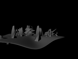
A lot more modeling

Most modeling done
With my men figures

Started Coloring


With everything but lighting.


In the process of trying to render an image with the lighting, my computer crashed taking the save file with it. I didn't feel I had the time to really start over so I'm submitting this as is. I will start again playing with it when I don't have a deadline that I had already passed.

353 3rd Reflective Essay

Here are textures that mimic stone, steel, and some very interesting ground. They give a kind of dark, brooding feel to the image. I know the ground was detailed with clay. I'm not sure about the stone or steel. 

This image has stone, water and crystal textures. When mixed with the colors it gives a cool, damp mood to the image as well as the idea that there may be a musty smell.

LuLu from Final Fantasy X. Embroidery, leather, velvet and fur are some of the major textures. There is also the use of stone and clouds in the background. The leather on the dress as well as the embroidery looks like it could be a lambert that has been tweeked. The fur and velvet almost look like jpgs. The clouds could be a maya fluid container.


353 2nd Reflective Essay

The general compositions is slightly asymmetrical. The foreground uses a repoussoir. The scale gets smaller as things go back and some of the detail is lost. The value contrast between the foreground and mid to back ground helps give more depth.

The Color here is mainly warm. The most visual details are in the foreground. The background on the top left is hazed out with atmosphere. Foreground overlaps the mid-ground. The value contrast goes from light to dark as the ground recedes.


I would say this picture is a fair mix of warm and cool colors. Details in the front. The contrast between foreground and background give a real sense of depth. The value contrast in the tree gives a slight repoussoir effect to the sides of the image.

Monday, March 14, 2011

Animated Button Essay

A button is a form of on/off switch that can be used to make things happen or make them stop happening. In the digital world buttons can restart an action, pause an action, save something, and a variety of other things. The design of a button can give a tone to whatever it is being used on. More graphical buttons can be full of whimsy while more simple buttons can add an air of sophistication or business like professionalism.

I love the Easy Button from Staples.  I also enjoy the fabled red button of doom seen in cartoons and movies throughout the ages.

Animated Dingbat Essay

I think 90% of the experiences in life are interactive. One of my favorites is getting together with my Magic group and having a night of drinking and gaming. Hanging out with them is very subconscious during the act. I follow my instincts and go with whatever flow there is. It is a great feeling to be surrounded by people like yourself, that get the same jokes and like the same things. It is easy to get caught up in it and not want to leave.

The same thing happens to me when I play a really good video game. I get caught in the story and am carried along by the feelings it produces. I get sucked in by the visuals and background sounds to a point that I can imagine myself as the character I'm playing. This is again a very subconscious, instinctive experience.

Again, the same feelings are produced when one reads a good story and visualizes the environment and the motions in the story. It is a much more conscious experience in that you have to focus on imagining to some extent but it is satisfying none the less.

I design my interactive media with that idea that you can just be carried along by what is going on so the interactivity I use is rather minimal.

Tuesday, March 8, 2011

Final

My Final

I've been having a really hard time with cyberduck so I'm hosting my final here until I figure it out more.

Monday, January 17, 2011

Collages


Collage Reflective Essay

I altered the document size on several occasions. Being able to drag from the library was nice but for a lot of my collages I would simply drag one instance to the area I needed and if I needed more I would just copy, paste and adjust from there. 


I always think a little too literally about my work but I did have a lot of fun just messing around. I had a couple of Ideas going into this project but for the most part I played. In some ways I was still very connected to my work because I chose to manipulate as much as I did. I also played with a lot of different tools this time, mainly the decor pencil.

Tuesday, January 11, 2011

ART 353 Blockville


I like all of my images so I refuse to pick a best one.  It has been a blast getting back into Maya again. I haven't returned to edit my work yet but I will because I don't feel any of these scenes are 'finished'. The idea of 'finished' for this project was mainly trying not to go too far past the set time limit I gave myself. If I worked for my idea of 'finished' I wouldn't even have one done.

My reference images came mostly from diving into the internet and finding things that looked cool. In picking what I would model I tried to go for each of the techniques for depth and sizing mentioned in class for variety.

Dingbats And Reflective Essay

I feel the need to say that anyone who can name everything is this pic gets 1000 nerd cred points!!!!

Now to the reflective essay portion:
I came up with my theme before I started drawing. I've been getting more and more into nerd and internet cultures so this was a very fun project to do. I had ideas in mind so I picked very specific references and I used them a lot more than I thought I would. So many of my images came out very close to the way I wanted that I didn't revise much.  I did have some problems with my D20. It had 20s on every face but when resizing the symbol as a whole the numbers got very contorted and became unusable.

Drawing in flash is okay. I would prefer using Illustrator for a lot of the work. Illustrator just seems easier to get the results I want with out a lot of extraneous finagling. There is only one dingbat that was something I had worked with before and I'm sure it is obvious as to which one it is.

Friday, January 7, 2011

[Art 353] Project 1: Reference Material

These are the 10 images I've chosen for my block city reference material.

November 2008


2004


1984


2009


2001


June 2008


351 Dingbats References

So my chosen theme for my dingbats is going to be Nerd Core. Some of my idea images are as follows:


This is just a few of the images in my file.